
Graphic patterns, a poetic and subtle photo universe, a rounded typography, blue-white-red colours… Every detail of our new visual identity has been carefully thought to fully reflect our purpose: To seamlessly integrate into the extraordinary experiences…
Intuitive search tools, online chat with our advisers, reminder system… We have paid particular attention to the user experience, in order to offer you a fluid navigation and bring you the solutions you need, as naturally as possible.
This work is the result of a collaboration with several communication experts including Julien Delatte from One thing at time, and Macha Kontchakova & Emma Brante from Frontline Studio.

« We were in the midst of a transformation, in a competitive landscape that was being profoundly redrawn since the arrival of platforms. In 2019, we were approaching 100 years of existence with international projects, key digital innovations and new offers for our clients. So many present and future transformations made it necessary to question the role of Chabé in order to accompany its growth and mark its difference. That’s why we asked Julien Delatte to advise us on how to make our brand even stronger for our clients, partners and employees« explains Guillaume Connan, President of Chabé.

« My main mission was to support and facilitate the Group’s growth by optimising its brand narrative » Julien Delatte emphasises.
To ensure this, Julien’s work was divided into 4 steps, the first of which was to understand the business model, challenges and prospects. The second phase was the diagnosis and ideation, followed by the recommendation and finally the execution.
« For several weeks, I audited Chabé’s customers, management, administrative staff and chauffeurs, in order to create an accurate and coherent brand identity for the various players in the Group, » adds Julien.
« It was a very interesting job, because during the meetings, all the clients interviewed recognised the obvious leadership, high standards and interesting development prospects.
Internally, several values stood out, such as team spirit, unfailing composure, kindness and the resulting attention to detail…«
After this audit, Julien wanted to finalize his support with a working group bringing together various Chabé employees, such as the IT, Sales, Communication, HR, Chauffeur and Dispatch departments.

With the brand platform completed, the founder of One Thing at Time handed over the reins to two experts in luxury brand communication, Macha and Emma, who were responsible for developing the brand platform into a visual and graphic universe.
« We have worked with Julien on the redesign of the visual identity of several luxury brands. This new project for Chabé inspired us a lot: helping a historical brand to find its language and identity in an « uberized » world and giving it a touch of modernity and elegance, these are challenges that we like very much at Frontline studio« underline Macha and Emma.
 « With our growth ambitions, we wanted to show our difference by breaking away from the statutory codes of luxury for a more subjective universe. This in-depth work on our image was an opportunity for us to redesign our website and the perfect time to revamp our visual identity, » explains Leslie Moica, Sales & Marketing Director. « Our logo has evolved since Chabé was founded, so we wanted to give it a new lease of life while keeping the original logo created in 2003. »
« Regarding the photographs, rather than illustrating the chauffeur’s profession, we wanted to retranscribe the experience of the client who, comfortably installed in the back of a beautiful car, discovers a city, sees its monuments, feels the sun, the light… The sensory and poetic universe in black and white has taken place in the communication of Chabé », explain Macha et Emma.



« In the continuity of this research, we reworked the graphic universe of the brand by taking our inspiration from the language of the Arts Deco, the era in which Chabé was born. From the brand’s logo, we developed geometric patterns that now adorn and enrich the website » add Macha et Emma.
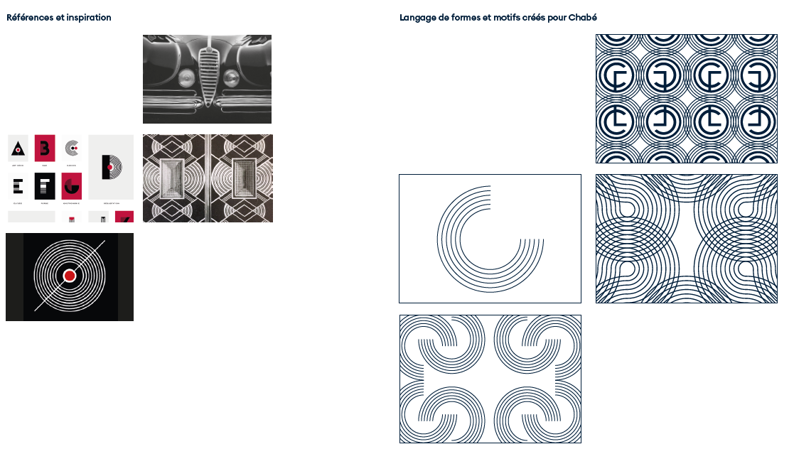
« Chabé is a centenary French family business which wishes to develop internationally. We wanted to show our territory by recalling the colours of our country of origin: blue, white and red, » Leslie Moica emphasises.
Frontline Studio, led by Macha Konchakova and Emma Brante, then managed the redesign of the website with the help of Vanessa Banier, editor, Franck Juery, photographer and Benjamin Levaux, webmaster.
« We wanted to develop the customer experience so that they could quickly find what they were looking for, but also be accompanied throughout their visit, in particular by an online chat with experienced advisers and a telephone call-back system » says Leslie Moica.
« After several months of intense work, we are delighted with this new brand platform and the overhaul of our visual identity, which are in line with our values and the image we wish to convey. Chabé is a spry centenarian that is constantly evolving, and this renewal has done it a lot of good! » concludes Guillaume Connan.